Visualisation
Note
Currently, the visualisation only works with the interpolation of variables. That means that you should only visualise variables that are continuous, for example temperature. Variables like thermal conductivity, that are homogeneous inside the individual bodies, cannot be displayed correctly yet.
Note
Visualisation works by linearly interpolating data that is tied to the individual surfaces. In order to obtain robust profiles it is therefore necessary to use a GMS model with refined surfaces, especially for profiles within bodies with radiogenic heat production!
Profiles
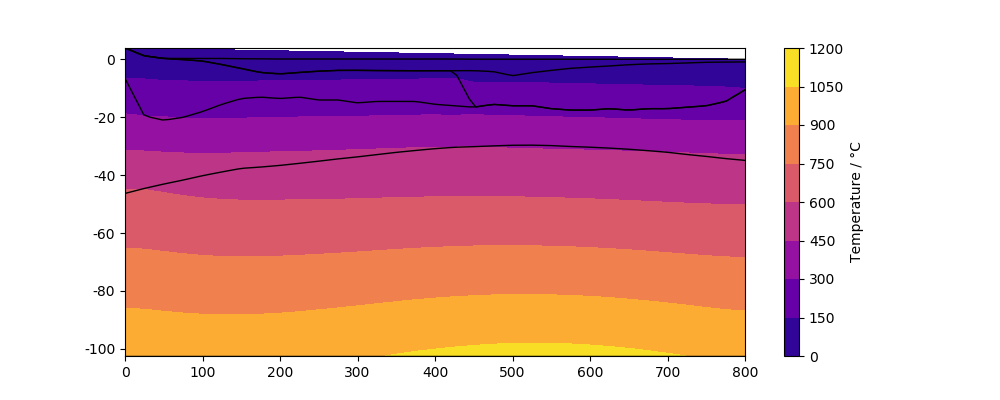
pyGMS can be used to visualise the model in 2D. This is an example for a temperature profile:
In [1]: from pyGMS import GMS
   ...: import matplotlib.pyplot as pl
   ...: from matplotlib import tri
   ...: model = GMS('../../examples/model.fem')
   ...: model.layer_add_var('T')
   ...:
Loading ../../examples/model.fem
Done!
Triangulating layers
Done!

In [2]: x0 = 200e3
   ...: y0 = 7000e3
   ...: x1 = 1000e3
   ...: y1 = 7000e3
   ...: fig, ax = plt.subplots(figsize=(10, 4))
   ...: cm = model.plot_profile(x0, y0, x1, y1, var='T', ax=ax, cmap='plasma')
   ...: model.plot_layer_bounds(x0, y0, x1, y1, ax=ax)
   ...: fig.colorbar(cm, ax=ax, label='Temperature / °C');
   ...:
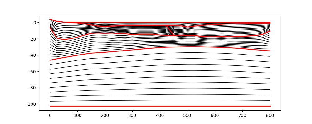
Note that we call the method plot_layer_bounds() in
order to plot the layer boundaries. This method plots by default only the
unique layer boundaries. In order to examine the refined layer boundaries use
the argument only='all':
In [3]: fig, ax = plt.subplots(figsize=(10, 4))
   ...: model.plot_layer_bounds(x0, y0, x1, y1, ax=ax, only='all')
   ...: model.plot_layer_bounds(x0, y0, x1, y1, ax=ax, only='unique', lc='red', lw=2);
   ...:
Wells
The Well is widely used within pyGMS to extract and
compute properties. A well can also directly be used to plot some properties:
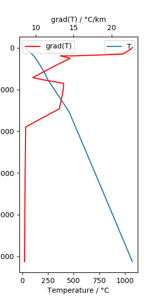
In [4]: well = model.get_well(600e3, 7000e3, 'T')

In [5]: fig, ax = plt.subplots(figsize=(3,6))
   ...: ax2 = ax.twiny()
   ...: well.plot_var('T', ax=ax)
   ...: well.plot_grad('T', scale=-1000, ax=ax2, color='red')
   ...: ax.legend()
   ...: ax2.legend()
   ...: ax.set_xlabel('Temperature / °C')
   ...: ax.set_ylabel('Elevation / m')
   ...: ax2.set_xlabel('grad(T) / °C/km')
   ...:
Out[5]: Text(0.5, 0, 'grad(T) / °C/km')